Last year, we wrote that Windows 11 was, in a word, unnecessary. Have six months changed our opinion? No, though there are signs that Microsoft is fixing some of Windows 11’s most obvious flaws.
Because virtually all of Microsoft’s development work now takes place on Windows 11, by necessity most of my work is done on Microsoft’s latest operating system. I’ve left most of my family’s PCs running Windows 10, however, in part because they’re simply used to the familiar Windows 10 environment. I still think that’s the right decision for most people.
What follows isn’t a re-review of Windows 11. But it’s a good opportunity to think about whether the original review was influenced by first impressions, and what, if anything, Microsoft has accomplished in the intervening months.
Start, Taskbar, Themes and more: Still no fun
At release, Windows 11’s most significant flaw was that it feels both less fun and less functional. That’s still the case, months later.
Case in point: In Windows 10, navigating to Personalization > Themes brings up large, vibrant icons telling you what themes you have installed, tacitly encouraging you to use them. Technically, the same options are available within Windows 11, but everything is far more subdued. Your PC feels less like an extension of your personality than a condominium with a few paint schemes that have been pre-approved by an HOA.
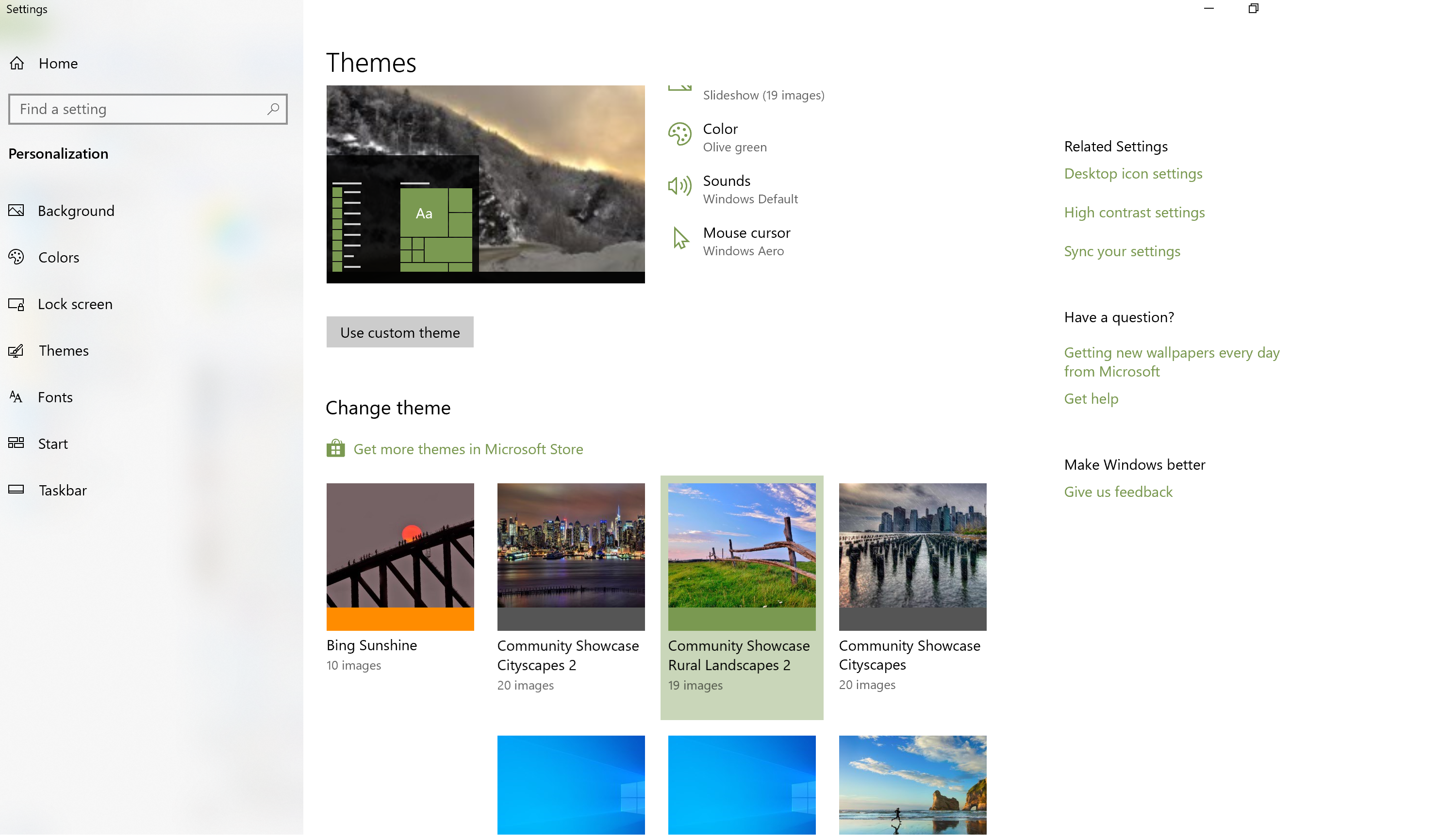
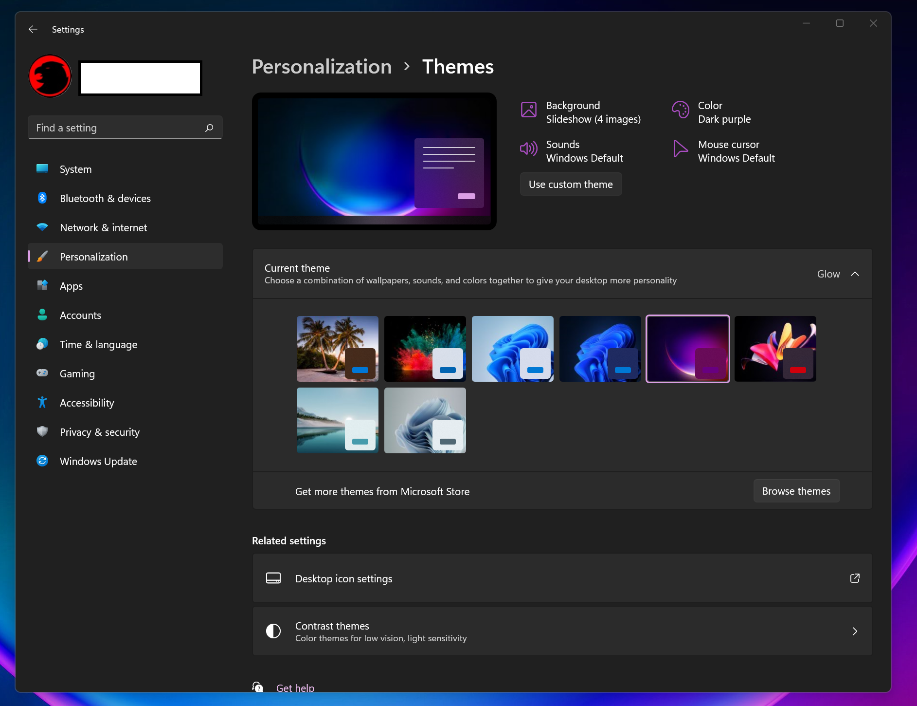
Personalization matters, which is why we wrote a “how to personalize your PC” story for Windows 10. But that story includes a section that’s hardly applicable to Windows 11: the Start menu.
To be fair, I use the Start menu as a “Start” about half the time. Windows has a variety of ways to launch apps within Windows. You can also type Win+R to “run” programs, or simply “search” for them by hitting the Windows key, typing the name of the app, and hitting Enter. I usually launch apps using the latter method.
When I do need to use the Start menu, though, I really loathe doing so in Windows 11. It feels so horribly institutional, a sea of icons with no rhyme or reason. Yes, I know that Start folders appear to be scheduled for release during the fall, but let’s face it: They’ve already botched those too. One of the key visual elements of Windows 10 was the ability to visually weigh specific apps and folders by resizing them. Now, you can group Windows 11 apps together in a folder and make the icons smaller as a consequence. Doesn’t this contravene the idea of making Windows more accessible?
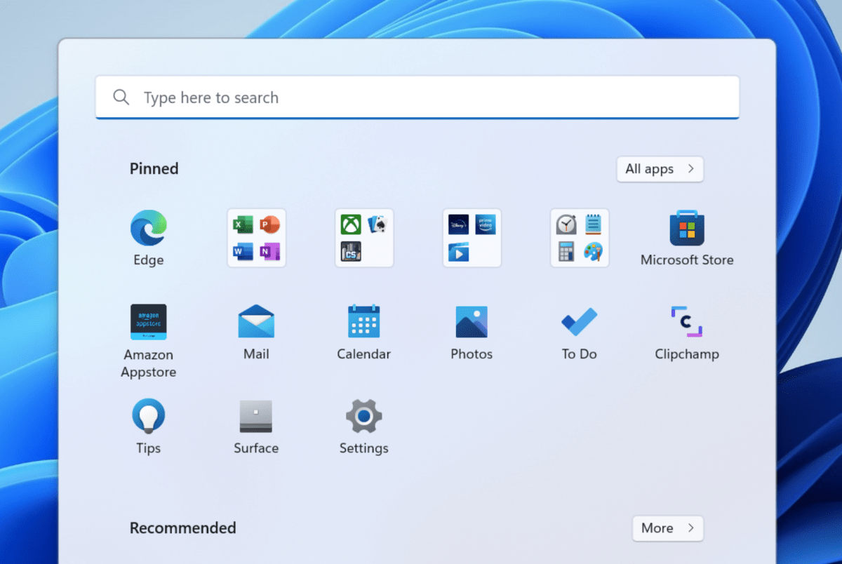
At this point, I simply can’t see why Microsoft enforces such ridiculous limitations on the ability of users to resize the Start menu as a whole. Those of us who prioritize aesthetics can leave everything primly centered. Otherwise, why not offer people the freedom of choice to expand their workspace?
Choice matters, too. I can understand Microsoft placing the most commonly used apps front and center within Start. But they’re clogged with Microsoft’s insistence that I include, say, the Instagram app, which I’ve literally never used. In Windows 10, you can see both the preferred app tiles alongside the alphabetical list of apps. Windows 11 secrets the list of alphabetical apps behind the “All apps” button, and I… simply forget about them.
Basically, I simply refuse to engage with the Start menu if I can avoid it. It’s frustrating and futile, and I haven’t even mentioned the wasted space that is the “Recommended” files at the bottom of it. At least you can turn those off. (Go to Settings, then Personalization>Start>Show recently opened items in Start, Jump Lists, and File Explorer and toggle the buttton “off.”)
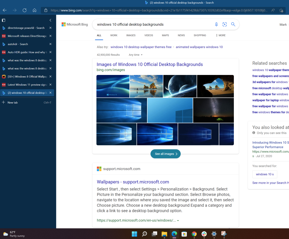
The same argument holds for the taskbar. I honestly have no issue if Microsoft wants to move all the way away from the Fisher-Price tiled layout of Windows 8 into an ultra-efficient, clean layout, with an aesthetic that collects icons into the center of screen with minimal badging. But again, it’s about flexibility. I wouldn’t dream of putting my Favorites bar within Edge onto the left-hand nav bar…but Edge does allow you that choice. So why not Windows?
Mark Hachman / IDG
Fortunately, third-party tools like Start11 and StartAllBack fix many (but not all) of the most annoying issues with Windows 11’s Start menu and taskbar. It would be nice if Microsoft did the same officially.
Widgets, Teams Chat, and Search: The forgotten functions
I can say only one thing about Teams Chat: I went to the Settings menu (Personalization > Taskbar) and toggled it off months ago. I have Google Meet, I have the “real” Microsoft Teams, and I have Zoom. I simply don’t need anything else.
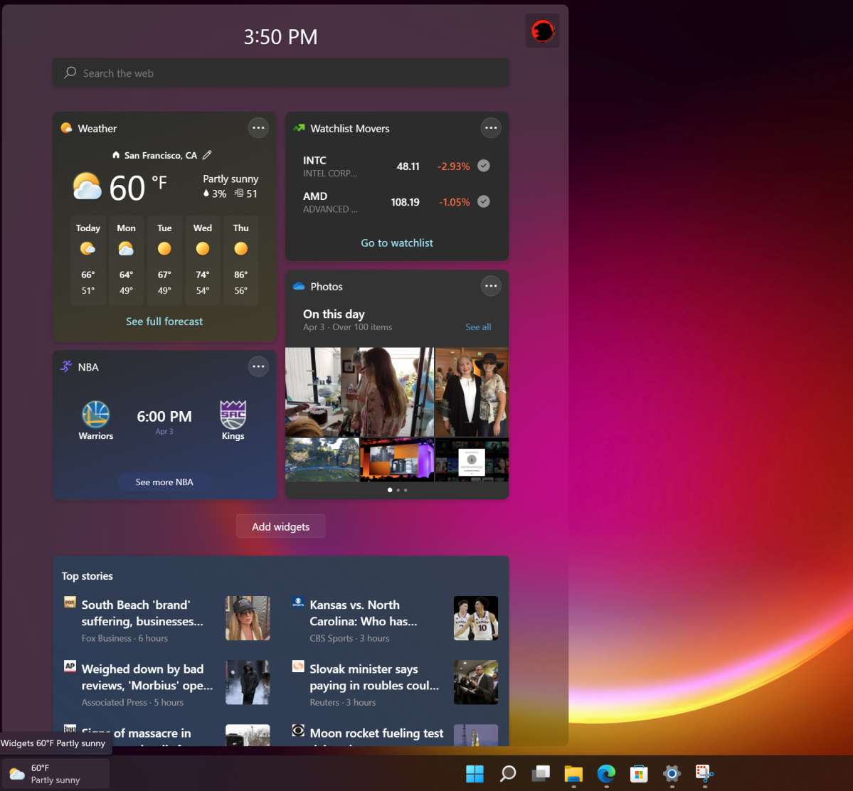
As a journalist, I’m technically in favor of Widgets, Microsoft’s collection of news and information. But I usually don’t bother hovering over the weather icon in the taskbar to trigger Widgets. It’s just not in my muscle memory. On the other hand, I chronically read an article or two in Edge every time I open a new tab in the “Informational” view. Microsoft/Edge/Bing benefits either way, I suppose.
That’s probably the same way I view Windows’ built-in Search icon — it’s simply not programmed into my daily use. As I’ve noted above, I “search” to launch apps, but most of my Internet searches are conducted via a browser or file searches within File Explorer, or I simply open the most recent document within a specific app. My gut tells me that I could probably be more efficient by using the Search app, and it might be worth forcing myself into the habit to see if that’s a more effective method. Maybe I’ve become acclimated to using a search bar, which is what I tended to use in Windows 10.
Mark Hachman / IDG
I do miss Cortana, somewhat. But I honestly don’t care what service I use for general queries, such as the exchange rate of the euro or when Halo was first released. Cortana doesn’t seem like it’s worth installing just for quickly setting up reminders, which is one reason I used it fairly heavily in Windows 10.
Action Center and Notifications: A step forward
My opinion has changed on the Action Center, which occupies the lower right-hand corner within Windows 11. After a few months, I’ve come to like how everything is clustered together, rather than being scattered across multiple taskbar icons on Windows 10. But it’s not perfect; in Windows 10, the various icons present more opportunities to communicate information, such as which audio device is being controlled by the volume slider. I also find I look at the notifications less than I used to.
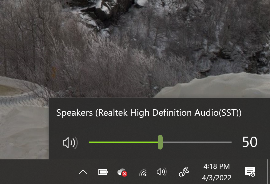
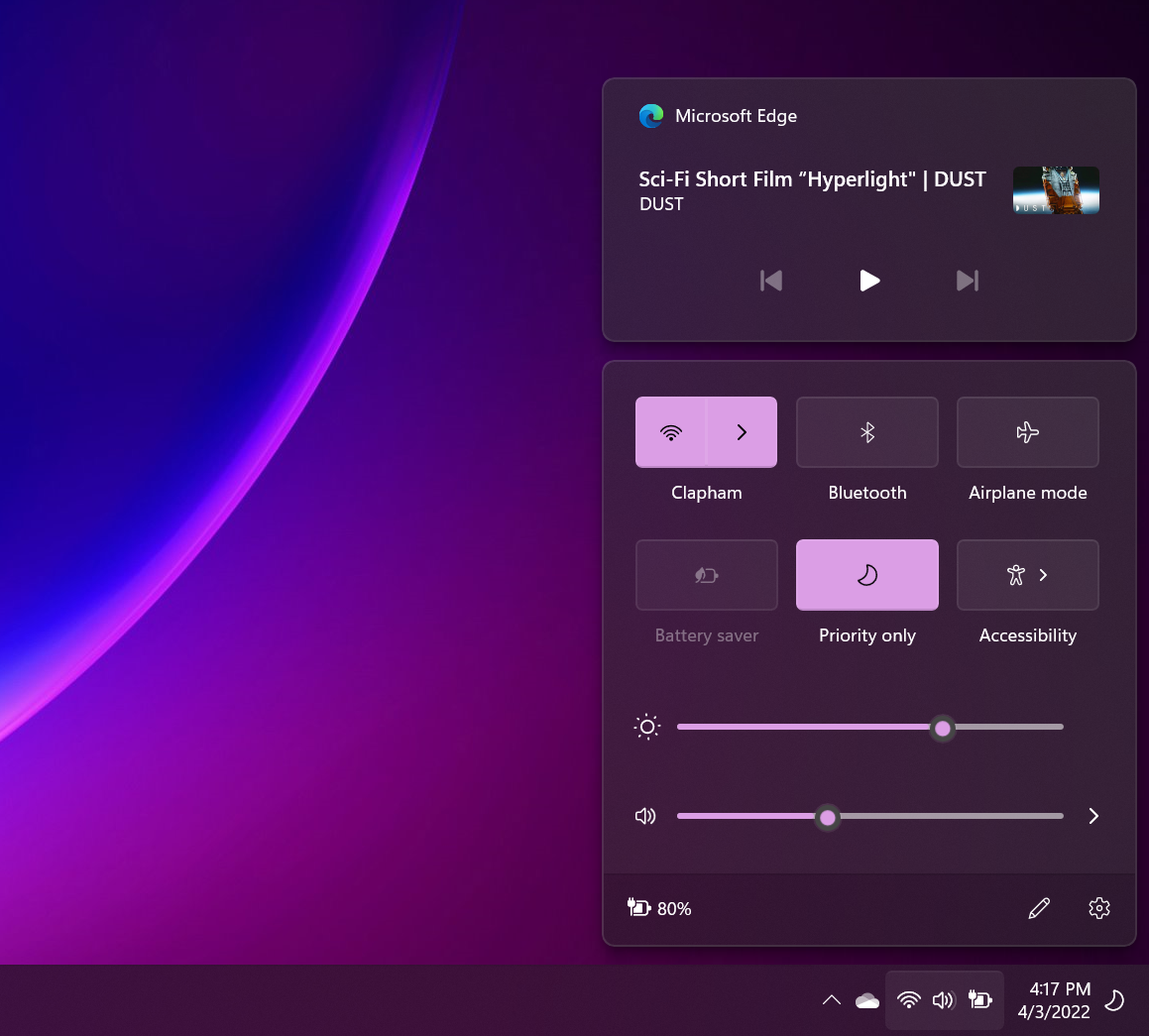
The real glaring issue with the Action Center is the lack of a fully-functional calendar, which just seems too weird. What’s the point of a calendar if I can’t add appointments to it, review holidays, or simply do anything with it? With Cortana being pushed aside, there’s no real simple way to schedule a quick reminder. (Microsoft To Do volunteers, as the first thing it does is ask to be pinned to the Taskbar. Shouldn’t this be part of the operating system, though? You need to manually install it via the Microsoft Store.)
Windows 11 also presents this weird UI interface in that the OneDrive cloud storage icon is a functional yet hidden button; yet so are the cluster of the networking icon, the volume icon, and the battery icon. Click anywhere in the latter group and the Action Center opens. Where I often get confused is after I turn on Focus Assist, the icon that indicates it’s on and working (the crescent moon icon, in the screenshot above) appears to the far right, next to the time and date. Clicking on that opens the notifications, instead…with the Focus Assist settings all the way at the top. It’s like a treasure map!
At least they finally restored the clock to multi-monitor setups.
The Windows Shell: Still some basic problems
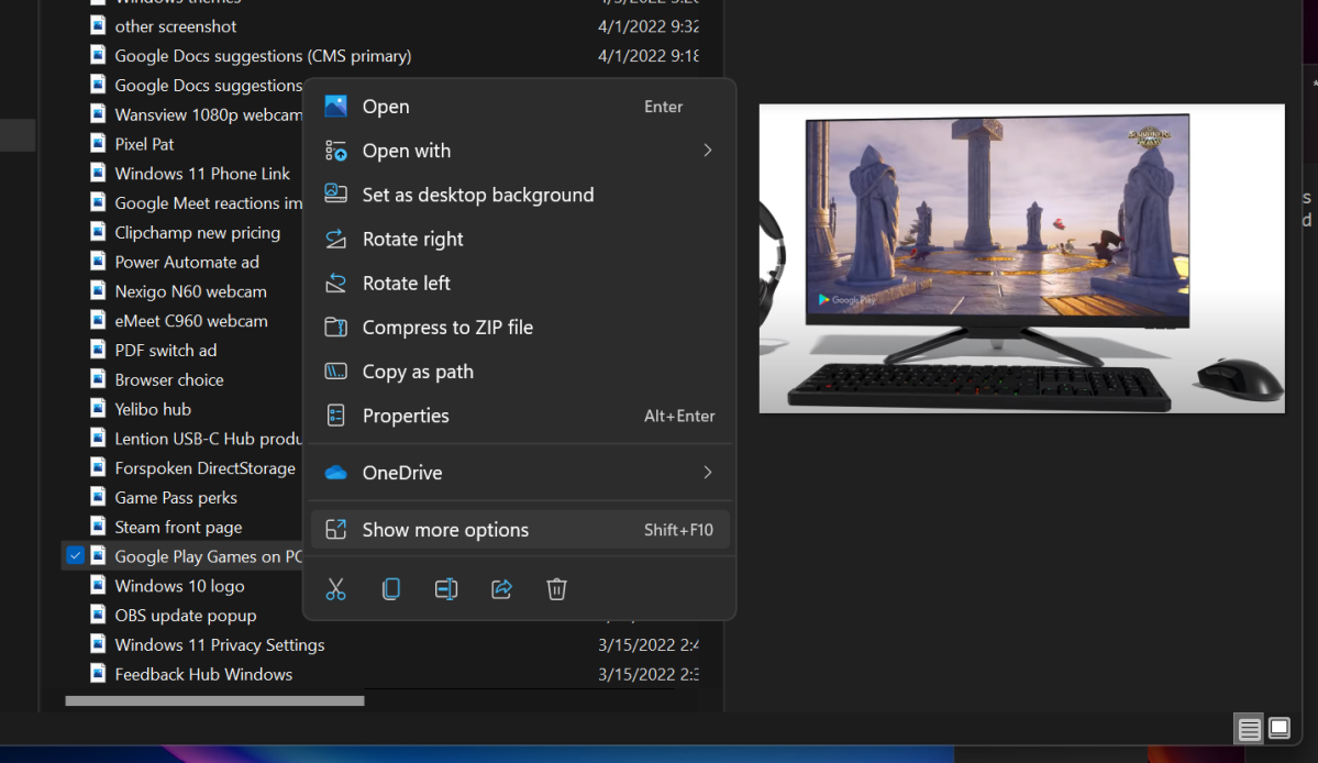
My colleague Alaina Yee detests the Windows shell, and she’s absolutely right. The menu system that appears when you right-click a file, and then cascades over to a secondary menu requiring a second click, is unforgivable. Couldn’t this all live on a single menu? Why should “approved” Windows apps like PowerToys place their PowerResize capabilities on a secondary menu, especially ones that certain users (like me) use frequently? I’ve finally learned which of the shortcut icons (like “cut” and “rename”) represent which functions, but the right-click menu options still feel sloppy. They’re a big step backwards in efficiency.
Mark Hachman / IDG
I still think Snap View is a success, though, and a marked improvement over Windows 10. Yes, you can still use PowerToys and its fantastic Fancy Zones utility in either Windows 10 or Windows 11, but Snap View’s ability to partition part of your screen is really handy, and the default alignments usually satisfy my requirements.
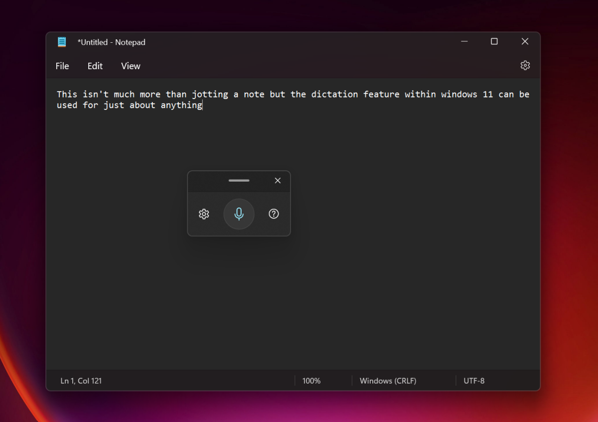
I’m still a fan of dictation, too. For whatever reason, I don’t have to be in the mood to type a long phrase, and a quick tap of WIN+H opens up the dictation widget almost instantly. I say the phrase, tap Win+H again, and move on. You don’t have to write everything in dictation! It’s especially handy for locked PDF files you want to copy a paragraph or two from, but are prevented from doing so.
It feels, though, like Microsoft’s designers have never quite found the right way to manage files. I don’t love File Explorer in either Windows 10 or Windows 11, and no matter what I do it feels like I expend far too much effort looking for what I’m searching for. Using the File Explorer’s search bar feels unnecessarily slow. I don’t instinctively click the Search button, though, nor do I search for documents by name. I tend to simply “search” for files using the respective apps, or folders such as Photos. I’ve always felt that searching for files is where I, as well as Windows, flail.
Mark Hachman / IDG
Bur there’s a bigger problem, and, frankly, I’m not even sure that Windows is the answer. As more and more collaboration moves online, “files” are increasingly being stored or shared or collaborated on within apps like Google Workplace, Zoom, Teams, and more. But it’s more than that. “Knowledge,” whether it’s a to-do list or a shared insight with a colleague, simply isn’t a “file.” Can I use Windows’ built-in Search to search Teams? Maybe eventually, but not now. Zoom? Google Meet? Not at all. If Windows can’t even understand what I’m looking for, as well as where it’s found, what good is a search function or file explorer, anyway?
Microsoft Edge: Finally, you can easily switch
Microsoft finally seems to have resolved its serious issue of a lack of browser choice in Windows 11, via an optional update that will almost certainly pushed to the general Windows 11 user base as part of an upcoming Patch Tuesday. It still feels a bit sleazy — the “one-click” option to make a browser like Chrome your default browser still sets Edge as your default browser for opening PDF files, for example — but it at least gives consumers back the choice that should have never been taken away in the first place.
Microsoft Store and Windows apps: It all looks nice
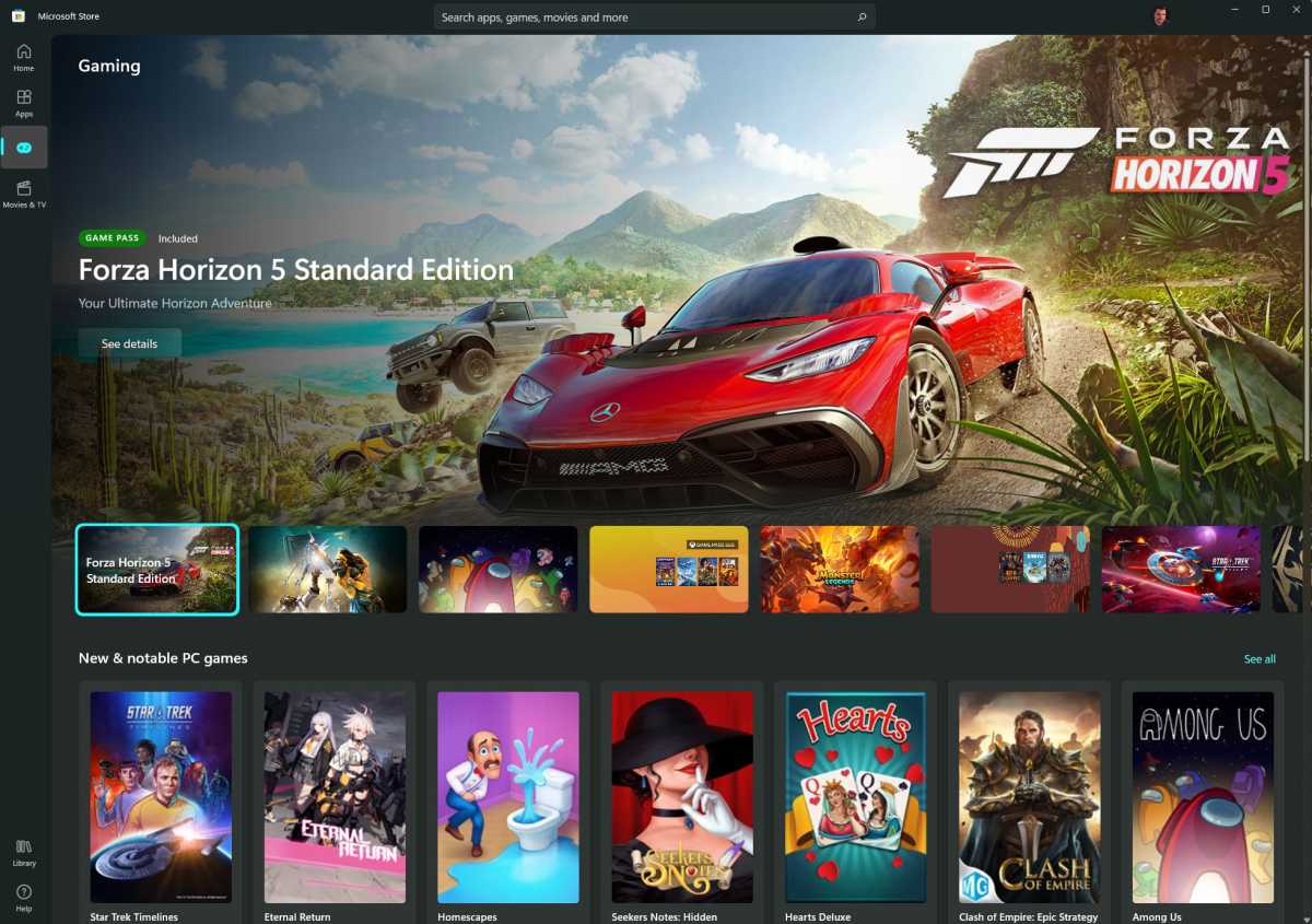
On balance, Microsoft’s changes to Windows apps have been positive, though not profound. Say what you want about the Microsoft Store’s utility — you can hardly argue that it doesn’t look more professional and feels more useful, at least on the app pages. The front page of the Store, though, still feels sparse.
Microsoft revamped the Photos app, making it far worse — then fixed it, somewhat, largely accomplishing its original goals. You’re still not going to convince me that the app wholly improved, though, with the elimination of the “spot fix” tool as well as separating the profoundly useful Magic Select tool in Paint 3D. Microsoft also unnecessarily reorganized Paint, the app that Microsoft has tried to kill before. Again, redesigning for the sake of a redesign simply messes with muscle memory and makes people less productive.
Microsoft
I enjoy using the Windows 11’s new Terminal and PowerShell apps, though I hardly ever have a need to.
Under the hood: PC makers are pushing the hardest
Really, the strongest argument for Windows 11 currently isn’t the operating system, but what’s inside the chassis. Virtually all new PCs now ship with Windows 11, so the most advanced laptops in my office now run Microsoft’s latest operating system. In part, that’s likely because of Intel and the Thread Director technology it made synonymous with its 12th-gen Alder Lake Core chips. But it’s also due to Microsoft’s goal to push PCs into the modern era of security, ruling out most older PCs with strict hardware requirements (that it later relented). To be fair, we haven’t seen Windows 11, and its Virtualization Based Security (VBS) cause any drastic hits to performance save for on much older, unsupported hardware.
Microsoft also integrated three other fundamental technologies as selling points for Windows 11: DirectStorage, Dynamic Refresh Rate, and AutoHDR. Of these, DirectStorage appears like it could provide a profound advantage to Windows 11 gaming. After releasing DirectStorage in March, Microsoft showed how it could cut game loading times down to about a second. We still don’t know how many games the technology will end up in, though, or when those games will even be released.
Otherwise, I haven’t seen Dynamic Refresh Rate or AutoHDR present a significant upgrade. It’s nice to use DRR to run a laptop display at 120Hz, especially for inking, but how often do I do that? On the other hand, 120Hz displays do make a difference, even just moving an interface around.
Matt Smith performed a direct evaluation of AutoHDR on PCs, which adds HDR detail to games that don’t natively support it. It’s noticeable, yes, but not that much of a selling point unless you have a top-grade HDR monitor. You’ll want one with a minimum of at least 1,000 nits of peak brightness to fully bask in its abilities, and those are rare indeed.
What’s being fixed
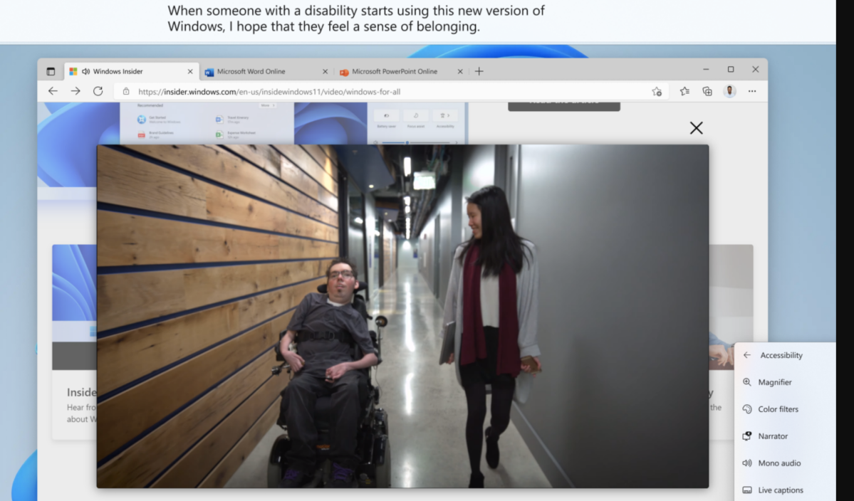
The recent release of a new build into Microsoft’s Beta Channel of its Insider program signals what Microsoft probably has planned for the fall: Start folders, the ability to drag-and-drop files into Taskbar shortcuts, and Live Captions, among others.
Start folders, as I explained earlier, don’t seem like they add that much to the Windows 11 experience. Being able to drag and drop a file onto the appropriate Taskbar shortcut and open that file is a nice feature that a small but vocal group of users demanded, and that’s fine — that shows, essentially, how the process of adding new features should work. And I really think that Live Captions are a useful feature that shows off Microsoft’s AI capabilities — but, more and more, content is being streamed via Netflix, YouTube, Amazon and others (even Teams!), which have closed-captioning services already.
Microsoft
Conclusion: Windows 11 isn’t there yet
I’m asked to review laptops periodically, and there are aspects of a laptop review I’ll suffer through. I’ll write the review using its keyboard, for example, to discover if it’s truly a black mark or if I just haven’t become used to it. Aside from the Start menu, I don’t really detest anything about Windows 11 — and with Start, I simply avoid using it by “searching” for an app, just like I might avoid a likely traffic jam by driving on surface streets instead.
But there’s little I still particularly recommend about Windows 11. I truly do like Snap View (again, which can be configured using Fancy Zones) and flipping on dictation from time to time. My general sense is that Microsoft is still trying to reconcile the changes it made with what users truly want, or at least complain about. In the future, a feature like DirectStorage could be what sells Windows 11 to gamers, and the more mainstream audience that leans on the enthusiast community for advice. Dictation works, and features like the Xbox app and its cloud gaming service certainly add value to Windows 11 and 10.
I’m willing to believe that, over time, I’ll warm to Windows 11. Maybe in six years or so, when Microsoft launches Windows 12, I’ll feel a pull of nostalgia. But, six months in, there’s still a genuine sense that Microsoft is playing catch up to where Windows 10 is now, and without a critical mass of features it needs to justify Windows 11 as a genuine improvement.


