Expert's Rating
Pros
- Free upgrade
- Microsoft’s new Edge browser is bundled in
- Alt + Tab functionality expands to Edge
Cons
- Start menu redesign is blah
Our Verdict
Microsoft’s Windows 10 20H2 fall update is another in a line of small updates, focusing on bug fixes. But the new Edge browser and tweaks to Alt + Tab and the Start menu elevate its importance.
Microsoft’s Windows 10 October 2020 Update (20H2) will usher the new Microsoft Edge browser onto millions of PCs, while upgrading the venerable Alt + Tab shortcut with a needed new function. But Microsoft’s designers have turned the once-colorful Start menu into watery gruel with a less-than-impressive visual update.
Update: The Windows 10 October 2020 Update is now available for you to download.
All in all, the Windows 10 October 2020 Update is another in a line of anemic fall feature updates. And that’s okay! We expected this. For the past two to three years, Microsoft’s major feature updates have coalesced within the “spring” releases, leaving mainly minor patches and quality updates for the fall release. (See the Windows 10 November 2019 Update.) This year is no different, though the small list of changes do allow for some interesting tweaks to your Windows 10 PC.
Microsoft said in late August that the Windows 10 October 2020 Update (Windows currently reports the version number as “20H2” in our preview build) has been released for commercial testing. We ran it through its paces in early September, using Microsoft’s Beta Channel (build 19042.508) as the source for our test builds, which Microsoft now says is the “final” build. Microsoft hasn’t indicated the exact date when the Windows 10 October 2020 Update will be released to the PC market at large.
Here’s what’s new in the Windows 10 October 2020 Update, and what it will mean to you. Note that, at the very end, we’ve added one tiny new feature that wasn’t available in our late-beta build.
 Mark Hachman / IDG
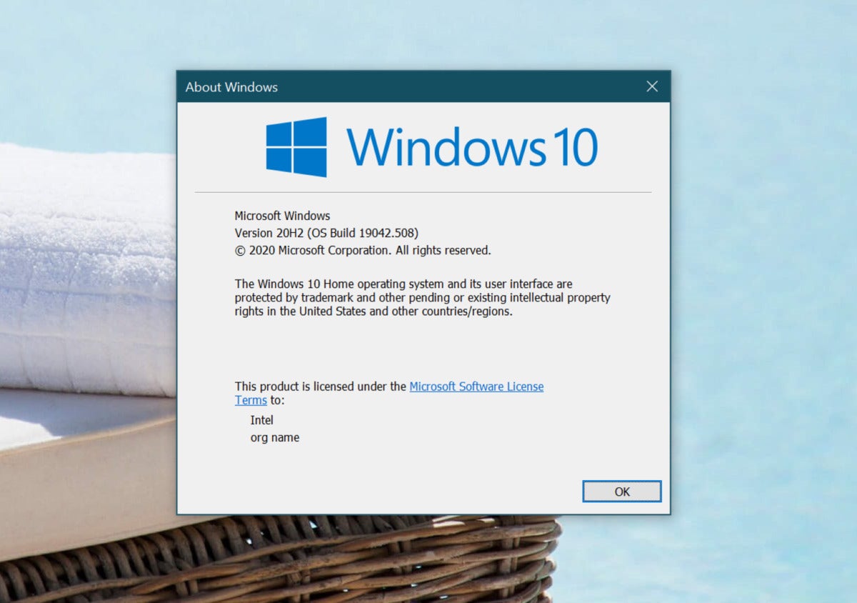
So far, the official version number of Windows 10 20H2 is… 20H2.
Speedy installation
You’ll be interested to know that the October 2020 update will most likely be lightning-fast.
“As with Windows 10, versions 1903 and 1909, versions 2004 and 20H2 share a common core operating system with an identical set of system files,” Microsoft program manager Aria Carley wrote. “New features are included in monthly quality updates for version 2004 in an inactive and dormant state. These new 20H2 features remain dormant until they are turned on through the ‘enablement package,’ a small, quick-to-install “master switch” that activates the Windows 10, version 20H2 features.”
On our test Surface devices, the update took approximately one minute, including a single reboot.
Start menu changes… for the worse
One of the more significant changes Microsoft has made to Windows 10 via the October 2020 Update involves the Start menu, and I don’t like it.
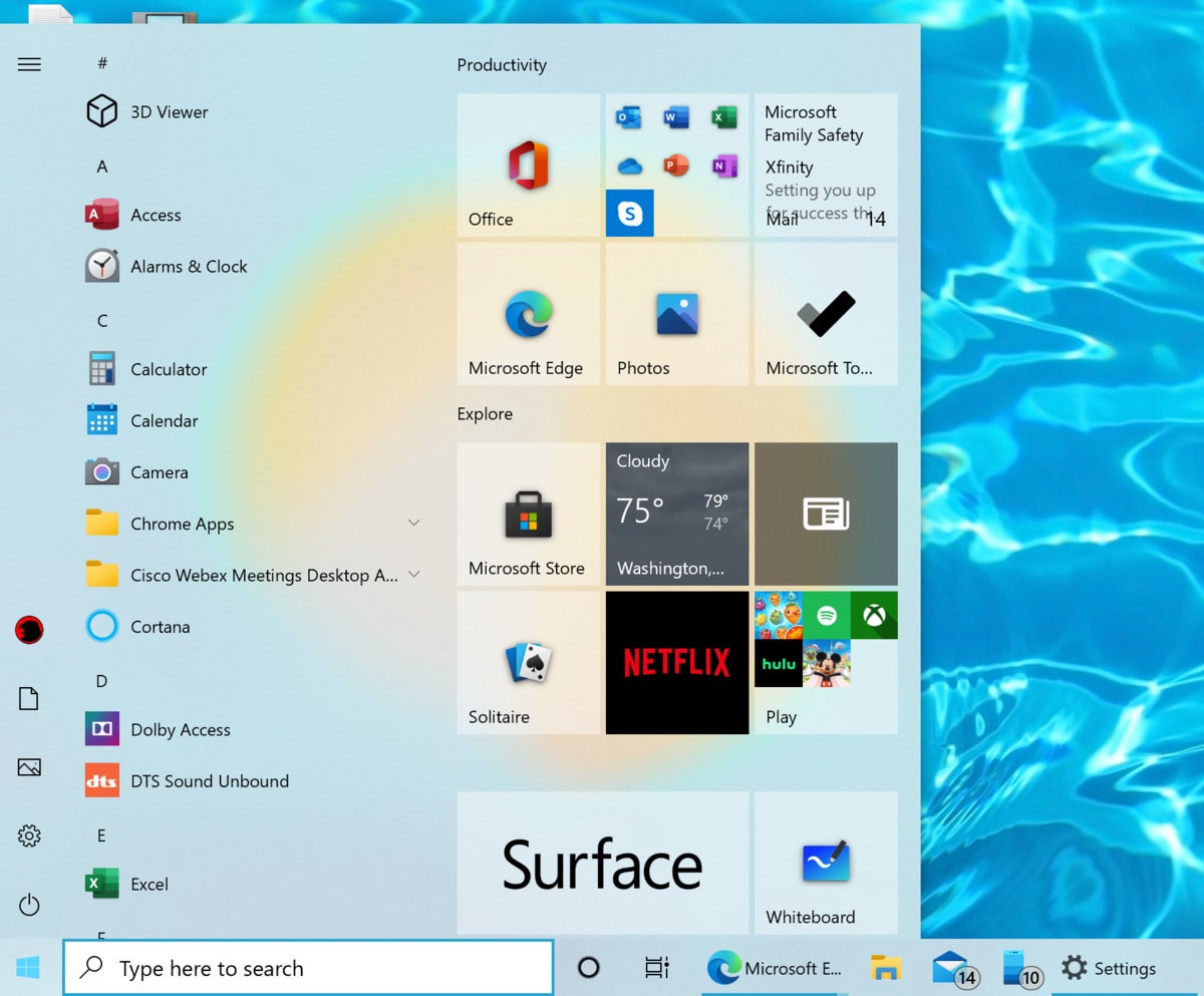
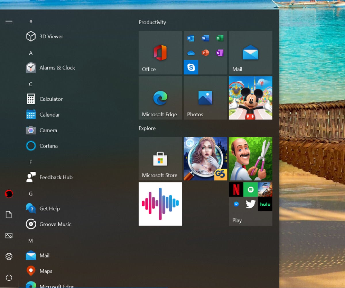
Whether you choose the “light” or “dark” options (Settings > Personalization > Colors), the Start menu in the current Windows 10 20H1 builds or earlier use accent colors as backgrounds for the individual tiles within the Start menu. To my eyes, that gives the light color scheme a bit of needed visual contrast. (In my opinion, dark mode looks okay within the 20H1 as well as the 20H2 color schemes.) But the light mode within Windows 10 October 2020 update just doesn’t really look attractive at all.
 Microsoft
Not every app conforms to the new Windows 10 October 2020 Update color scheme, which simply looks blah compared to the vibrant colors of yesteryear. The minimalist icons look nice, however.
If you choose the light color scheme option within the Windows 10 October 2020 Update, the Start menu and the tiles end up feeling pale, sterile and washed-out. Because the accent color option has been removed entirely from the Start menu, there doesn’t seem to be a way to inject any life back into the Start menu, unfortunately. Color taste can vary and some may appreciate the change, but I don’t.
You should see virtually all of the new Fluent Design icons Microsoft announced in February, in both the Start menu and the taskbar. Functionally, Microsoft has changed nothing here. Instead, the new icons help gives Windows a fresh, clean aesthetic that’s a positive step ahead.
 Mark Hachman / IDG
Of the two modes, the October 2020 Update’s Dark Mode still looks better.
Welcome to the new Edge
Here’s the biggest change that the Windows 10 October 2020 Update brings: the “new” Edge browser.
Windows is now on its third browser: the hidden Internet Explorer browser that still remains buried within Windows, the original Microsoft Edge, and the “new” Microsoft Edge that officially debuted earlier this year. The new version is based on Chromium, the same underpinnings as Google Chrome, and the same extensions now work across both plug-ins. The new Edge is efficient and smooth, though Microsoft still hasn’t quite managed to sync everything from an Edge browser on one PC to another, including a shared tab history.
 Mark Hachman / IDG
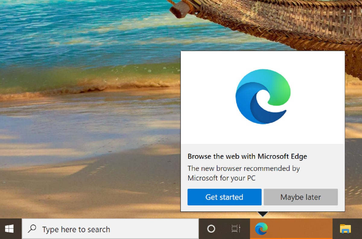
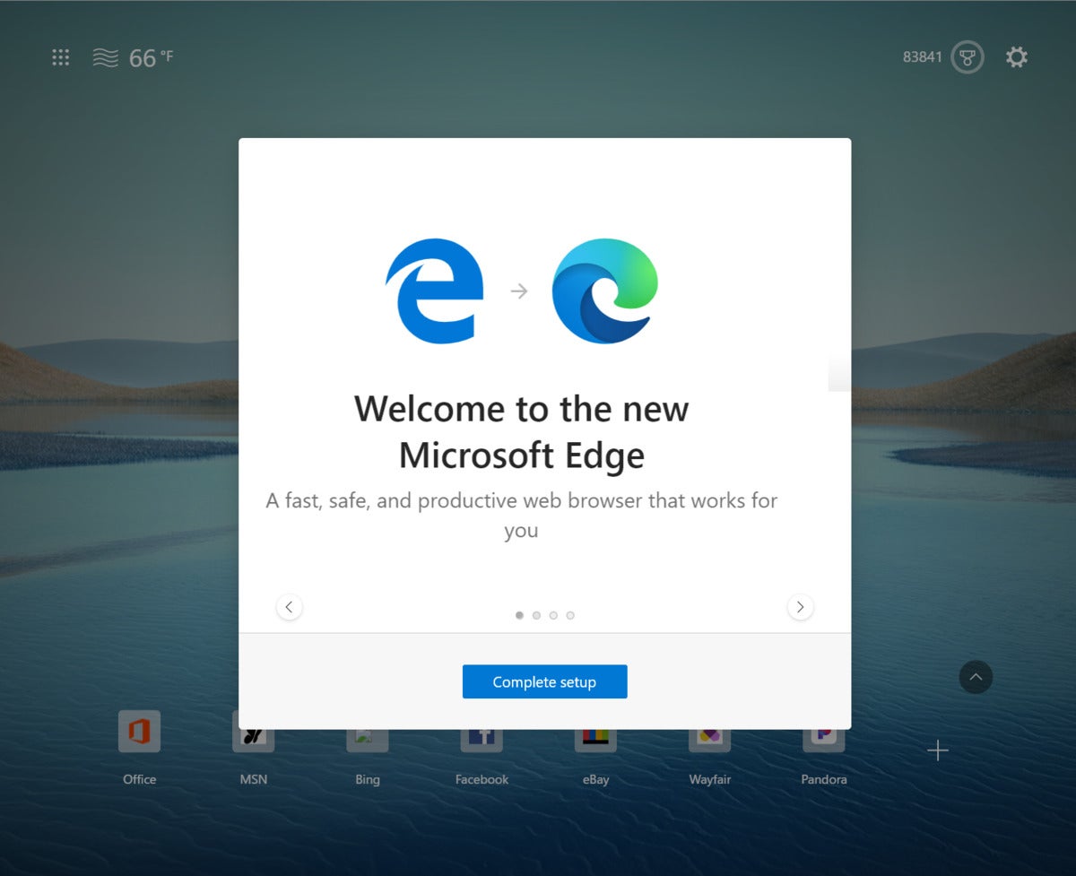
You’ll see a popup like this noting that the transition to the new Microsoft Edge browser is imminent.
With the October 2020 Update, Microsoft will begin swapping in the the new Edge for the old, with a transitional popup that signals the change. (Microsoft had said earlier this year that it planned to migrate PCs from the old Edge to the new throughout the year, so it’s possible that your PC has already updated.)
 Mark Hachman / IDG
A quick series of transitional slides will usher in the new experience.
If you’re in love with the old Edge, sorry: Microsoft’s forcing this change on users, with no way to back out. Still, Microsoft has handled the change well, making importing old favorites and passwords a snap. It’s not all perfect; I liked the way in which the older Edge handled PDF documents, though both the old and new Edge do share a lot of the same capabilities in this regard.
You’re free to use another browser, of course…but Microsoft’s also adding features specific to Edge, too—like the new Alt + Tab behavior, below.
 Mark Hachman / IDG
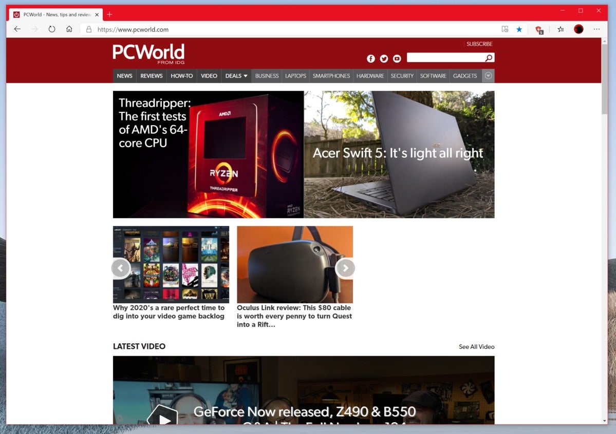
When all is said and done, the new Edge shouldn’t look too different from the old version.
Alt + Tab gains new powers
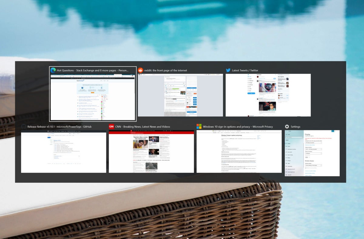
Traditionally, the venerable Alt+Tab command has switched among open applications. But as more and more work is done within the cloud and the browser, Windows is switching, too. Alt + Tab no longer treats Edge as a single, monolithic app. It now (optionally) switches you among the three or five most recently used tabs within Microsoft’s new Edge browser…or all of them.
 Mark Hachman / IDG
The new Alt + Tab experience seems to treat Edge as an app, and as a series of tabs that can be pulled out and cycled through.
This is handy. If you’re like me, you cycle among dozens of tabs, some of which are archived for reference purposes while others are actual, active webpages that I’m currently using. Because I use multiple monitors with several apps snapped via FancyZones to a portion of each screen, I really don’t need to switch between apps — but for my main monitor with dozens of tabs upon it, the ability to move easily among my most recently used Edge tabs is a handy addition.
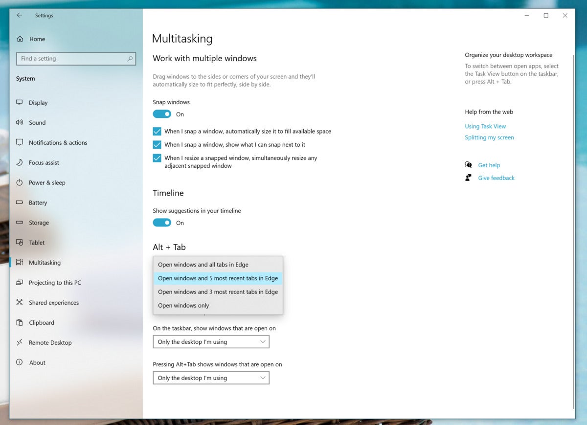
There’s one catch that you may have noticed already, however. The new Alt + Tab behavior only applies to Edge tabs—not the more popular Google Chrome, or any other browser like Firefox or Opera. (Because the “new Edge” now uses the same Chrome underpinnings as Google Chrome, however, there’s an argument for switching.) All of this can be managed by the Settings > System > Multitasking menu, under the Alt + Tab heading.
 Mark Hachman / IDG
A new Settings menu entry controls the ALT+Tab behavior.
Is this the best implementation of cycling between tabs? No. For one thing, Edge already allows you to jump between tabs (and just between tabs) using the Ctrl + Tab shortcut. And if you’re a power user, you should know that the rival Vivaldi browser allows you to scroll from tab to tab using the mousewheel while holding down the Alt key, another powerful tool. Still, Alt + Tab should be part of the muscle memory of any Windows user, and it should be easily integrated into your workflow.
Pinned tabs in the Taskbar
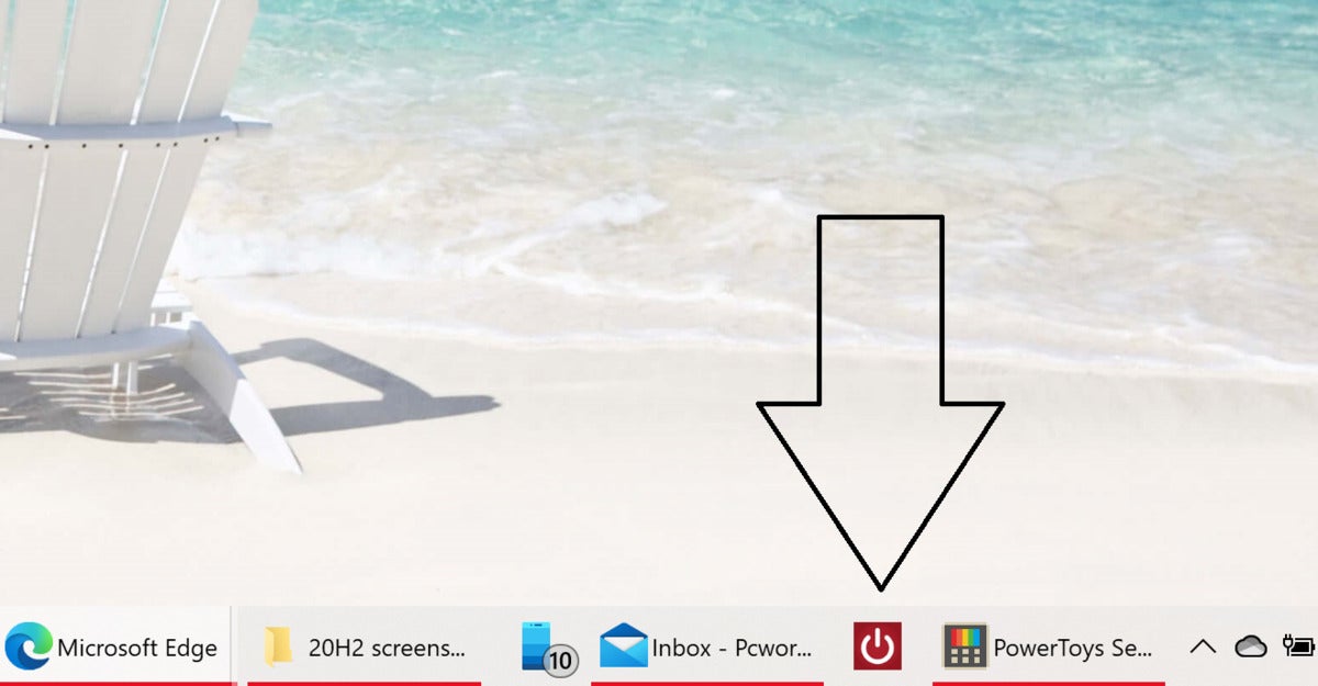
Windows 10’s October 2020 Update is also supposed to make some changes to the way pinned tabs work with the Taskbar. In existing versions of Edge, running on older versions of Windows, you can already “pin” Edge tabs to your taskbar. (Go to the three-dot menu in the upper right corner of Edge, scroll down to More tools then click to Pin to taskbar.) This moves the webpage’s favicon to the taskbar, and allows you to launch it (via your default browser) like any other tab.
 Mark Hachman / IDG
While apps can be pinned to the Taskbar in 20H2 (as well as in earlier versions), the Windows 10 October 2020 Update searches out the pinned tab among all of the others.
In 20H2, clicking the site’s icon on your taskbar apparently is supposed to reveal whether the site is already active within Edge, by highlighting it within the preview windows which appear when you hover your cursor over app tab in the Taskbar. For whatever reason, no preview window appears in 20H2 for pinned sites. Clicking the taskbar icon, though, will either snap your screen’s focus to the open tab in which the site appears, or—if the site is not currently open—open the tab. Edge could accomplish this by simply changing the behavior of the Favorites bar to open an existing tab of say, PCWorld.com, if you clicked the appropriate favorite. But Microsoft has chosen this different approach.
Modifying the way in which a pinned site operates on the taskbar… it all feels a bit like parsing the legalese on a mortgage document, doesn’t it? It just goes to show that 20H2 is indeed a minor update.
New taskbar arrangements
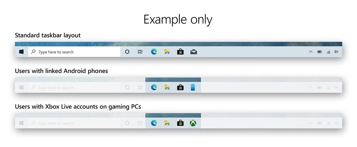
Since we’re on the subject of taskbars, Microsoft has another tweak in store for those who want to set up a new Windows 10 PC with the Windows 10 October 2020 Update installed. As you set up a new PC, Microsoft’s Out of the Box Experience, or OOBE, asks you to link your Microsoft account to your PC, and to your Android phone. Microsoft rewards you for this by automatically turning on your Microsoft 365 (Office) subscription, for example.
Now, there’s another small perk. If you link your Android phone to enable Your Phone experiences, or if Windows “knows” that you’re on a gaming PC with an Xbox Live account, Microsoft will set up your Taskbar accordingly.
 Microsoft
 Note that these adjustments are only for new PCs. Microsoft explicitly says it won’t adjust your Taskbar on your existing PC, recognizing that you probably have it set up as you like.
New tablet experience for Surface owners
If you own a Surface Pro detachable 2-in-1, Microsoft’s October 2020 Update also allows you greater configurability in shifting between “tablet” and desktop mode. Remember—and this is confusing—if you detach your Surface Pro tablet from the keyboard, you can work either in “tablet mode,” or not.
Tablet mode leaves the Windows 8-ish Start menu unchanged from the way it works within Windows 10’s May 2020 Update: it places a number of tiles in the center of your screen for you to select apps from. It also maintains the options to hide app icons on your taskbar, and to automatically hide the taskbar in tablet mode.
 Mark Hachman / IDG
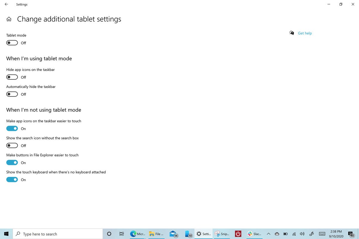
This is Windows 10 20H2 running on a disconnected Surface Pro tablet, but with tablet mode “off.” The Settings page is shown here to demonstrate the effects of your choices.
What’s new are additional options (within Settings, System > Tablet, and then to Change additional tablet settings) for when your tablet is detached, but you’re still not using tablet mode. This sometimes is referred to as “desktop mode,” or the awkward “When I’m not using tablet mode” in the 20H2 Settings menu.
In this mode, you can create a hybrid tablet/desktop mode environment, with four new options: make icons on the taskbar easier to touch, make buttons in File Explorer easier to touch, and show the touch keyboard when there’s no keyboard attached.
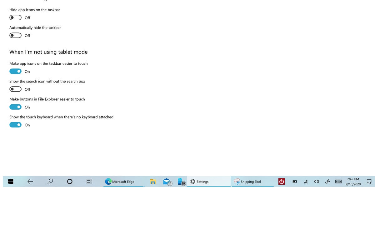
The fourth option, to show the search icon without the search box, will have the most profound effect. It allows your app icons plenty of room to breathe on your taskbar. Otherwise, you’ll notice a light shimmy if you toggle on the option to make your taskbar icons easier to touch, as they even out and take up more space.
 Mark Hachman / IDG
This is Windows 10’s October 2020 Update, disconnected but with tablet mode “on.” Note the differences in the Taskbar arrangement.
(Remember, you can already turn off the Search box within Windows by right-clicking the Taskbar, navigating to Search, and unchecking the Show search box listing.)
Other noteworthy changes
Here are other small, but noteworthy changes you’ll notice when you download the latest version.
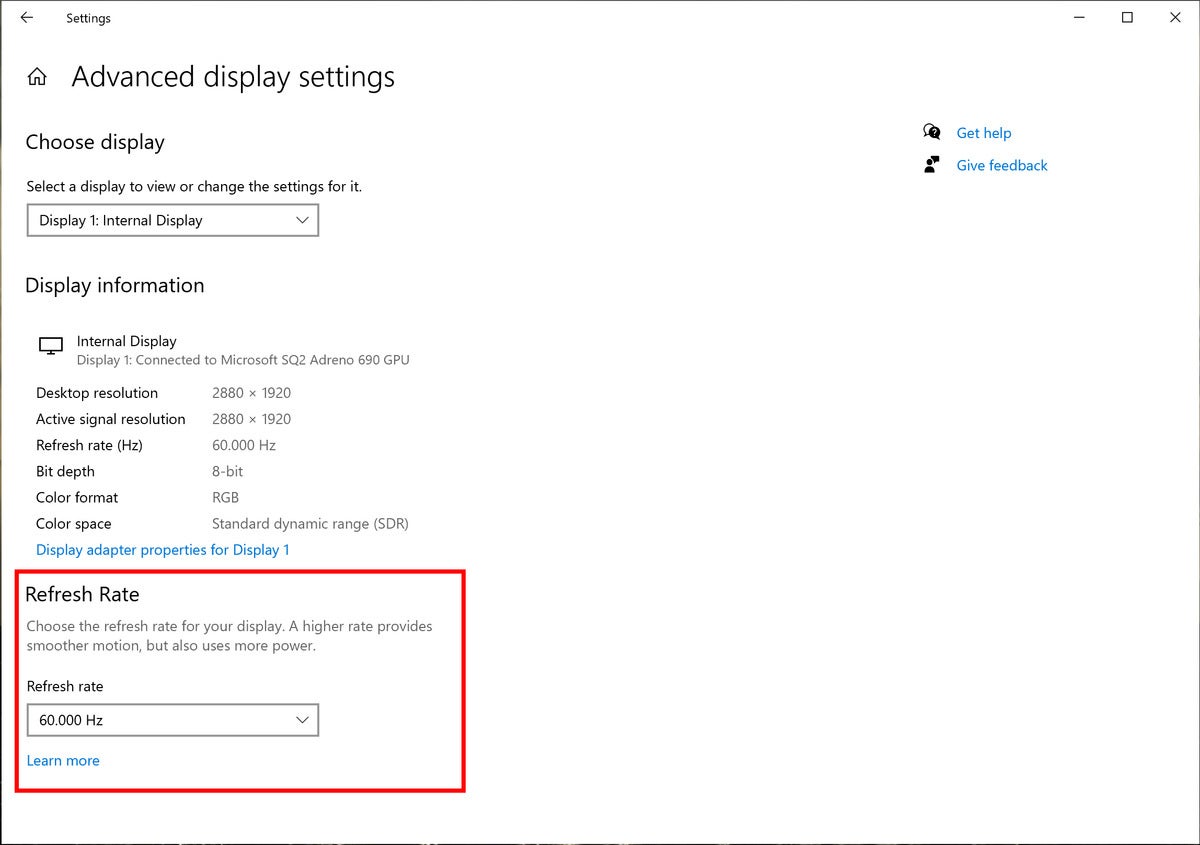
Display refresh-rate adjustment: This is the only late-breaking change that Microsoft added at the last minute, and it’s a pretty small one. Normally, you can go to the Settings (System > Display > Advanced Graphics Settings) and see a specific display’s refresh rate. You’ve also been able to adjust the refresh rate in apps like Nvidia Control Panel or in Windows’ own Device Manager. (Adjusting the refresh rate higher can make it easier on your eyes.) Now, that adjustment control has been brought into the Windows 10 Settings menu.
 Microsoft
Here’s where to find the refresh-rate adjustment controls.
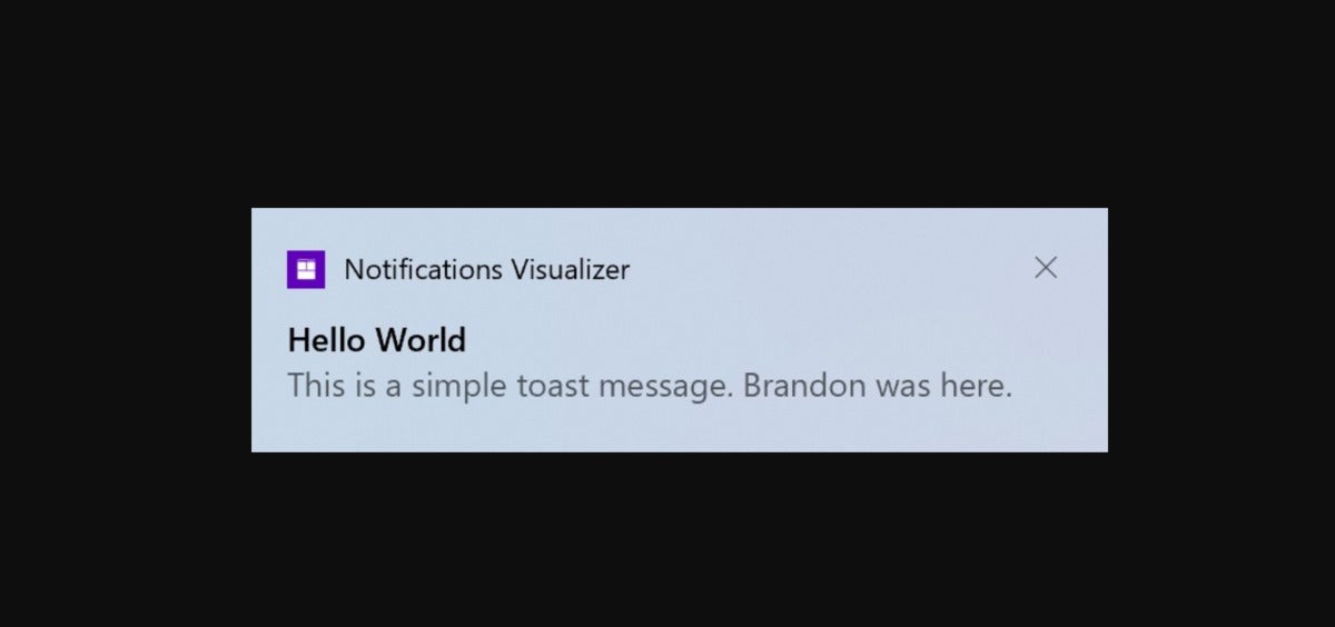
Notification tweaks: “Toast” notifications in the Action Center are being simplified, so there will just be an ‘x’ in the upper right. (The gear icon goes away.) If you’ve turned on Focus Assist to block notifications from appearing, any automatic triggering of Focus Assist will not prompt a notification, either.
 Microsoft
An example of the new notifications format within Windows 10 20H2. The settings gear has disappeared.
”About” Settings: If you’ve ever needed to quickly copy and paste the specifications unique to your PC (I haven’t, but you might), the Settings menu now accommodates your desire with “Copy” buttons that grab all the relevant information. The “System” page in the Control Panel has been removed as a result.
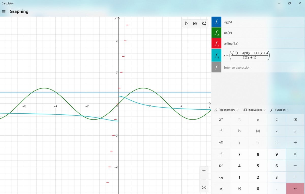
Notable app updates: More and more app updates are being made independently of Windows, on their own development cycles. One we like is the Windows Calculator app, which gained a nifty little graphics function during 20H2’s development cycle. If you’re connected to the Internet, though, check out Microsoft’s Math Solver page—it’s just as cool and more practical, too.
 Mark Hachman / IDG
Conclusion: A small step forward
The scope of the Windows 10 October 2020 Update feature release merits a review, even though the number of meaningful changes is relatively small. The big one, of course, is the new Edge browser—though that, too, is designed to be a simple transition. That’s good news for those hoping that Microsoft would leave Windows relatively unchanged, though there’s always the possibility for new bugs. However, ours is essentially a placeholder score.
What does the future hold? Microsoft has continued to publish new code as part of its Dev Channel, though that’s not officially part of any specific release. Will what may be called “21H1” reveal Windows 10X, and the Surface Neo? Or just more vanilla updates to Windows 10? We’ll have to wait and see.
This review was updated on October 20, 2020 to add details of the new display refresh-rate controls as well as to note that the October 2020 Update is now generally available for download.
